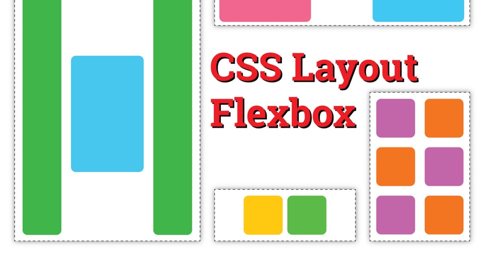


Flexbox is a one-dimensional layout method for arranging items in rows or columns. Items flex (expand) to fill additional space or shrink to fit into smaller spaces. This article explains all the fundamentals.
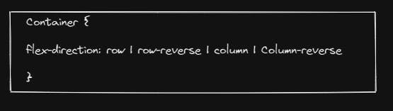
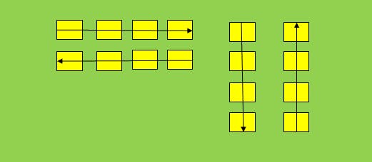
- Flex-Direction
Flex-direction arrange the items in row or column. It should be row -reverse and column-reverse
Example:
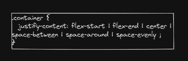
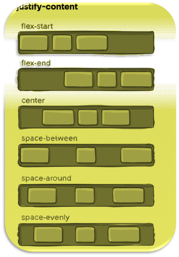
2. Justify-Content
This defines the alignment along the main axis. It helps distribute extra free space leftover when either all the flex items on a line are inflexible, or are flexible but have reached their maximum size. It also exerts some control over the alignment of items when they overflow the line.
Example:
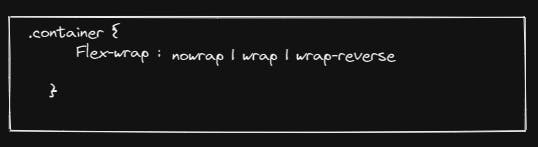
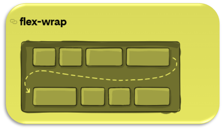
3.Flex-wrap
By default, flex items will all try to fit into one line. You can change that and allow the items to wrap as needed with this property.
Example:
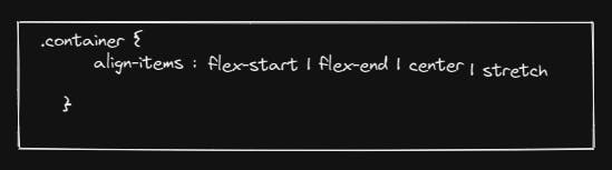
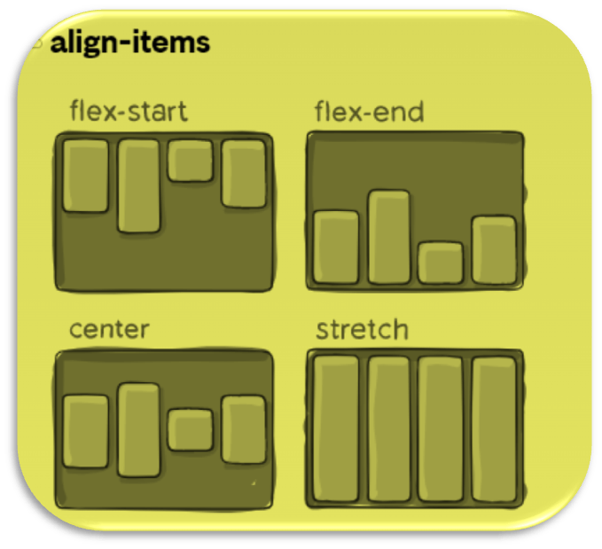
4.Align-item
This defines the default behavior for how flex items are laid out along the cross axis on the current line. Think of it as the justify-content version for the cross-axis (perpendicular to the main-axis).
Example:
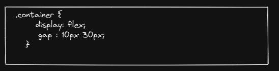
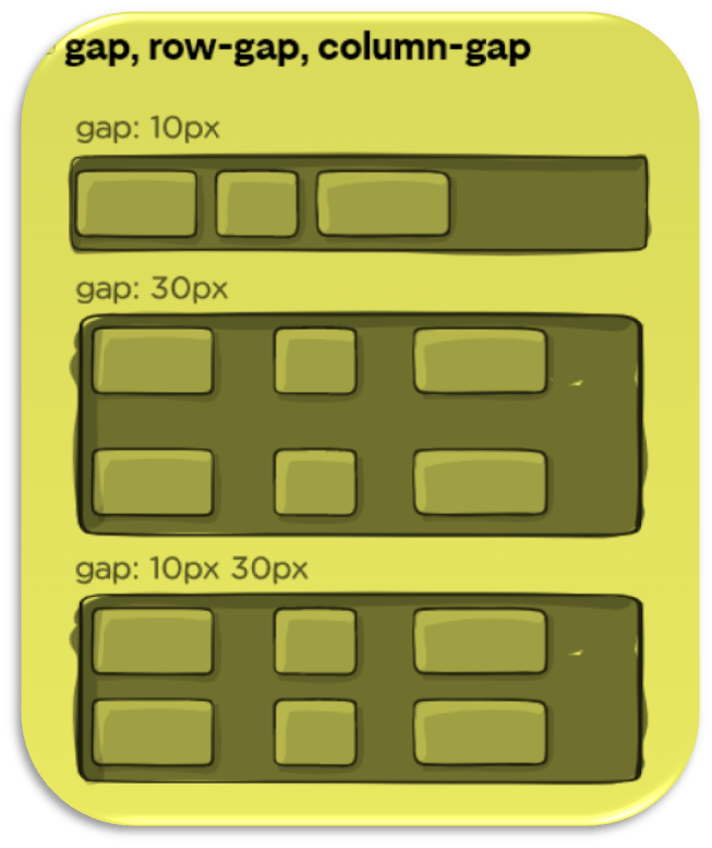
5. Gap
The gap property explicitly controls the space between flex items. It applies that spacing only between items not on the outer edges.
Example:
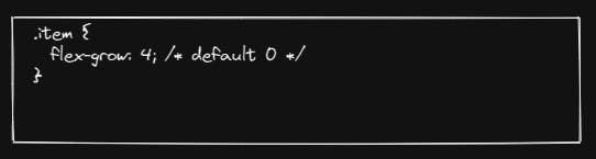
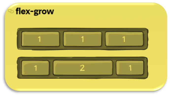
6.Grow This defines the ability for a flex item to grow if necessary. It accepts a unitless value that serves as a proportion. It dictates what amount of the available space inside the flex container the item should take up. If all items have flex-grow set to 1, the remaining space in the container will be distributed equally to all children. If one of the children has a value of 2, that child would take up twice as much of the space either one of the others (or it will try, at least).
Example: